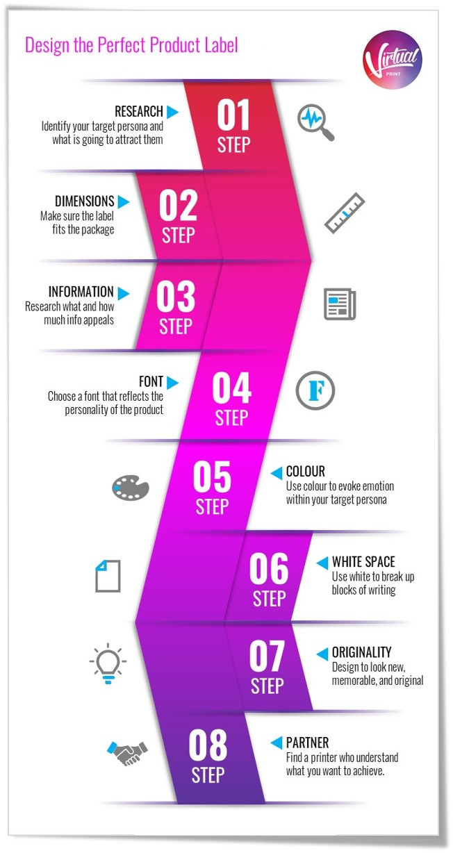
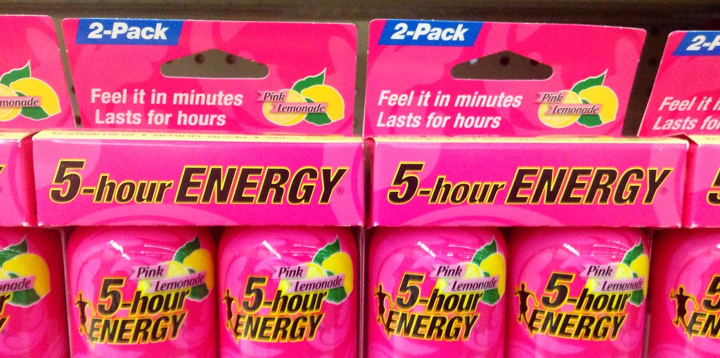
If you are a business that is looking to improve its brand identity and makes frequent use of labels, you may want to consider rethinking your current designs and terminology. This step by step guide will help you to formulate the basis of a strong visual brand by the use of adhesive labels attachable to your product line.
With a sound understanding of what makes a great label, any brand can differentiate itself from competitors. Although most companies that use labels are suppliers of supermarkets and bulk chains, this article applies to any company that is looking to recreate their brand image with effective label printing. An effective label will create a strong brand identity that will sway a consumer’s behaviour in favour of your company.
Research
A key marketing principle is to know who your target market is and what is going to attract them. So, finding out what your consumers want to buy is just as essential. By segmenting your target market into demographics (employment, education, income, marriage rates, age, etc), and geographics, you can get one step ahead of appealing to the people who are most likely to purchase your product.
However, research doesn’t just finish at analysing customers. It is also important to have a strong understanding of competitors and what they bring to the market. If you believe there’s room to improve on their labels, that is a niche that you can capitalise on. This vital information can assist you in getting a leg up on competing brands in a highly competitive environment. Supermarkets are a prime example of how you can be put up against competitors and the label could be the difference between the two.
Define Dimensions
If you are looking to start producing labels, make sure you know the dimensions that the label is to be made to. An easy way to get your dimensions is to simply ask your supplier about the packaging. They will have all of the specifications. Even easier, simply cut out a piece of paper that fits the packaging and measure accordingly.
This doesn’t just apply to the perimeter of the label, but also to the fonts you use.
Select Key Information
Too much information – or too little! Both are big problems. If you have too much text on your label it will overwhelm the reader, look cluttered and confusing. But not having enough information is frustrating for customers who are trying to decide if your product is right for them. So put yourself in the shoes of the customer. Make sure you answer their questions. Do you know what they are looking for? Do you know what their questions are? If not, ask them.
There is always a hierarchy of information on a label. Always place insignificant information on the back-side of the label in a smaller font. Slogans and product catchlines should always be a priority alongside name and other important details contributing to the selling of the product. Your label maker and graphic designer should always be aware of this.
Choose the Right Font
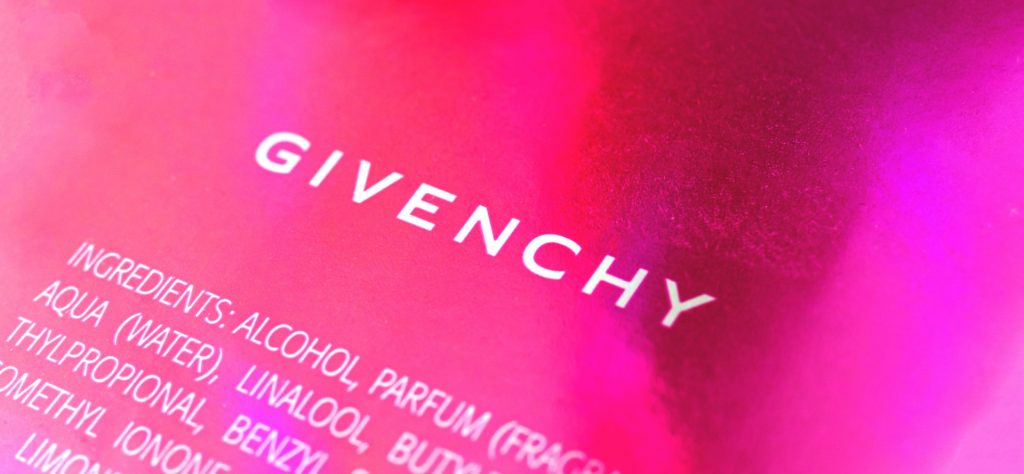
Choosing a font that reflects the product is key. This helps to build subconscious brand awareness and affiliation to a product as a consumer. With this being said, anything too eloquent risks losing readability. Something too simple may mislead the customer that the product is something it’s not. This is also termed as typography pairing. Be sure to hire the correct product designer who will tie in your product with your label imagery.
Commonly used fonts are not always the best type of lettering style. If you have access to a graphic designer or you have the knowledge to operate photoshop yourself, you should consider investing time into your custom font. These can also build on the company’s brand identity.
Choose a Colour Scheme
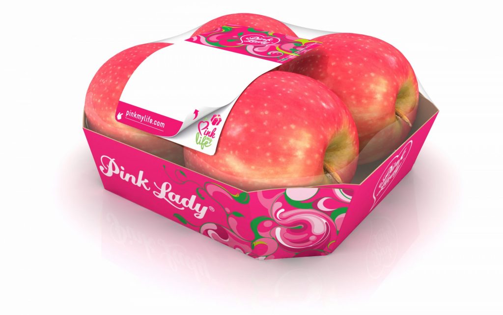
Much like choosing the font, it is important to finalise colour combinations that will be repeated throughout your entire range of marketing communications. Labels need to illustrate exactly what the product is about and evoke emotions with the consumer. This will always differ depending on what product you are offering. Labels are often more important than billboards, so it is just as important to choose colours that are unique and effective with your labels.
Be aware that colours may come out slightly differently when they have been printed. Before you make a bulk order of the labels, ensure that you see some samples of what it is going to look like. This also goes for the correct size and scale.
Emphasis on White Space
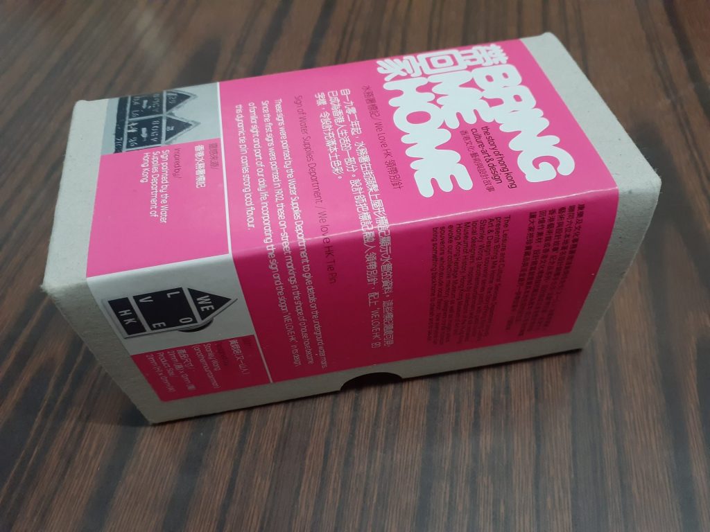
White space is simply an area that has not been utilised by the graphic designer on a label – it doesn’t have to be white! This helps to break up blocks of writing, and can assist the reader in filtering through the useful information of a label.
If a minimalist look is what you are trying to achieve for your brand, then careful consideration of where and where not to put writing is a must.
As with using typography to reflect your product, the same is true for great use of white space. An absence of content in certain areas of your label can emit a feeling of simplicity which can often show user-friendliness. Of course, ‘White space’ doesn’t have to be white, it can be any colour to suit your theme that you have decided on. This principle simply means an absence of content that can break up a label and prevent the possibility of it becoming cluttered and unreadable.
Maintain Originality
Your label design should look new, memorable, and original. Research your competitors to see how they have branded their products and labels. This is important not just to get ideas but to what you should stay away from. Legal battles have often ensued with close rivals because of the similarities of their designs. Creating something that stands out and will catch someone’s eye is crucial.
Something that is rendered obsolete by overuse and copying may get you into strife not to mention consumers are probably accustomed to what a certain label of a certain product looks like.
A label that’s eye-catching and uses good lettering is nothing unless it is something that people have never seen before. This is especially true if you are looking to enter a market rather than maintain a reputation in one.
Be aware that making something original doesn’t mean you have to cover all the space with excessive objects and writing. The barcode is an essential element that should be mentioned clearly in the design. It helps to gain a sense of authenticity, which otherwise also helps in dealing with any legal checking or quick audits. Effectively provide the company contact information to encourage communication with buyers.
Choose the Right Printing Partner
Throughout NZ several label manufacturers specialise in different fields. Make sure your label maker is trusted and has a sound reputation with current and past clients. Be sure to talk to friends and industry professionals about a good suit for your product. Be sure to know what the labels are going to be made from including the texture and grammar of the paper. Label makers use different techniques such as boiling lamination and stream printing, both of which can be used well in their appropriate contexts.
Be aware of consistency. After you have finalised your printing partner, make sure that the original label product is what you were happy with when they issued you the sample. Standards do drop-in label making companies from time to time so be aware of quality control and regular checks.
If you want to get started on your label visit https://www.virtualprint.co.nz/printing/labels/
About Virtual Print
We are a New Zealand based printing company and offer our online printing services across New Zealand. At Virtual Print, we love helping businesses with their printing, signage and other aspects of branding. We print it all – from brochures, labels, posters, business cards, desk calendars, banners , booklets, book printing to specialty items.
For more information about how to build an effective label for your company take a look at other articles:
https://www.banana-print.co.uk/blog/how-to-design-a-label/
https://www.designhill.com/design-blog/tips-for-designing-a-product-label/
