A boring business card usually gets what it deserves
According to Forbes, “you have 7 seconds to make a great impression.” What does your business card say about you? How do you need to do to make a great first impression?
Whether we like it or not, people are making judgements about us within seconds of meeting us for the first time. The only consolation is to know we are doing the same thing to them.
So, perhaps the only things worse than handing someone a business card that makes a poor first impression, is one that makes no impression at all. Imagine a business card so boring that the person you give it to barely even glances at it before shoving it into a pocket to be forgotten – which is what it deserves!
In this day and age, every business card has an opportunity to create a fantastic first impression.
Here are out top ten tips for creating a brilliant or beautiful business card – plus a bonus tip!
Express Your Brand Personality
Your “brand” isn’t your logo. Your brand is the combined experience people have with your organisation. Its what they remember, see, feel, smell, and experience with you. It’s the stories you have together. Its emotional and experiential. Its how they would describe your company if it was a person.
So, what have they experienced with your brand?
-
- Fun or formal?
- Conservative and serious
- Light and laughter?
- Adventure and excitement?
- Kind and caring?
- Masculine or Feminine?
Jennifer Aaker developed the Brand Personality Framework to help organisations think about their brand.
She suggested five broad categories:
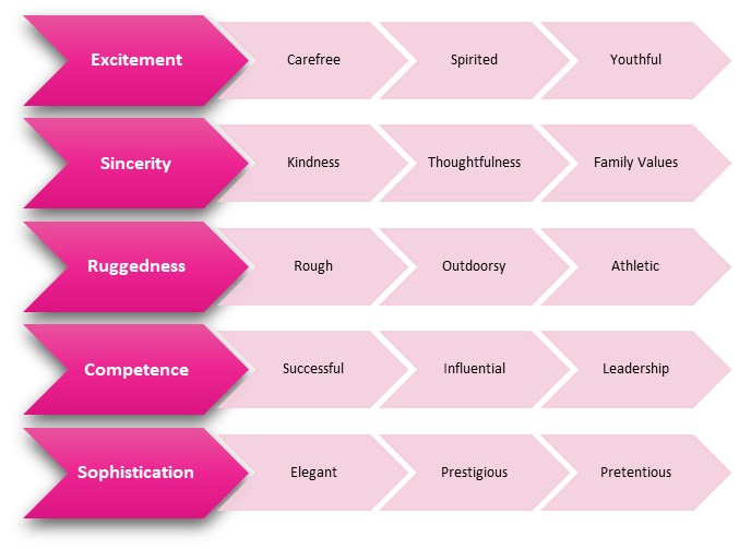
The Brand Personality Framework
I’m sure you can easily picture several brands that match each of these broad categories.
When Toyota used Barry Crump to advertise their Hilux brand, which of the above where they going for? When they established Lexus, was it still the same?
Which category matches your organsation? Which one would you like to?
“Customers are more likely to purchase a brand that resonates with their perception of themselves”
Why is this important?
Your brand personality is what people relate to? Its why they choose to get coffee from Starbucks instead of Robert Harris. Its why they buy Macpac rather than another outdoor brand.
They are essentially building a relationship that matters to them. At least that’s what you should be aiming for.
Implicit in all of this is that you are differentiating yourself from your competitors and encouraging resonance with your brand.
“With resonance comes relationship, awareness and loyalty”
Brand personality on your business card
Before you start designing your business card, think about what you want it to express.
-
- How do you want it to look? Is it bright and playful, or formal, serious and conservative?
- What sound does it make? Is it Bruce Willis or Matthew McConaughey? Is it Lady Gaga or Adelle? Is it a child laughing?
- What does it suggest about how your company acts? What experience should people expect when they buy from you?
Think About Your Audience
This tip flows directly from the first one.
If branding is all about inviting people into a relationship with your brand, who do you want to invite?
-
- Who are you appealing to?
- Who would benefit from your value proposition? Who definitely wouldn’t?
- Who are you compelling? Who are you comfortable with repelling?
Repelling? Does that make you uncomfortable? Are you someone who wants to please everyone?
Well maybe you can and maybe you can’t.
“It has been said that if you don’t stand for something you will fall for anything.”
So, don’t try to please everyone. Unless you are a supermarket.
What does your brand stand for?
Be as specific as you can about who would want your products… and who probably wouldn’t. Sometimes the easiest way to identify who you want to compel is to picture the opposite – who you don’t want to come.
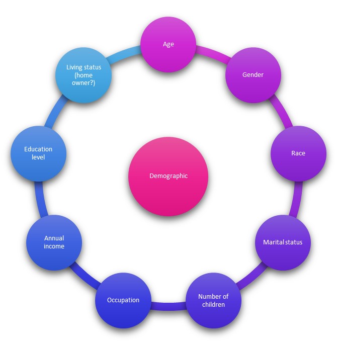
The most commonly used demographic segmentation factors
Are you appealing to customers with a certain education and income level? Are your products or services for children, or adults with no kids? Will people from a certain trade or profession for you irresistible?
Once you have identified who you are inviting to your brand, start to think about what appeals to them.
What message will appeal to children? What about mountain climbers or architects or lawyers?
“Put yourself in their shoes and think about how best to communicate with them”
Now translate that to your business card design.
Locate Your Logo
You will know by now that your logo must express the personality of your brand and resonate with your target audience.
So, take a moment to think about whether or not your logo is still relevant.
If not, find a design company you resonate with and ask them for your help.
But where to put the logo?
![]()
Top Left
This is the traditional, classic, look and works well in most cases.
Left space
A lot of people are using the entire left half of the business card for their logo.
Vertical
Why not have a vertical card instead of the classic horizontal?
Back of card
Use the entire back of the card for maximum impact.
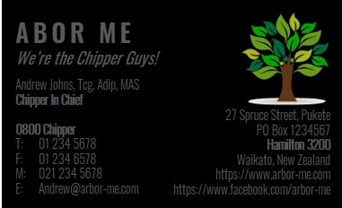
Do State the Obvious
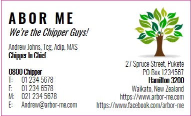
I know this should be simple, but it’s not the 90’s anymore. You don’t need a fax number anymore! S0, what information should you include on your business card in the 21st century?
-
- Business name (if you have one)
- Your name
- Job title, but only if it isn’t obvious from the business name
- Qualifications or memberships if it is expected in your profession
- Include your address even if you work from home. Even Google gets suspicious if you don’t have one
- Your contact information including phone number and an email address
- Consider you 0800 number if you want people to call that instead of you personally for sales related calls
- Website URL. You don’t need to include “https://” as it just takes up space
- For some people, their twitter handle or other social media accounts will be vital. For others, not so much
- If you have room, consider adding your tag line, or your value proposition, perhaps even a call to action!
Yes, I know. Sounds like a lot right? Read on…
Keep it Simple – Don’t Cram the Card
 The list above is quite significant. But it doesn’t apply equally to all people.
Make sure you cut it back to what you need. That is, if marketing is about relationships, how do you want people to engage with you?
You may need two business cards if you don’t want the whole world to have your mobile phone number.
Clutter is confusing. Confusion communicates. What do you want your card to say on your behalf?
It Shouldn’t be This Hard
In a similar vein to the previous point, make sure your card is easy to read.
Think again about your target market.
If you are appealing to older people and you have a tiny font, forget it! In fact, nobody thinks a tiny font is helpful. Just don’t.
Its not just size that matters
It is possible to get so creative that your card is hard to read. If you want to use cursive or handwritten fonts, make sure they are legible… as in easily legible.
Do you want to include a background image on your card? Excellent! But can the words still be read or are they getting lost in the… clutter?
 Colour can be confusing
I saw a business card the other day. The card was black with gray writing. And yes, it looked very cool.
But you had to hold on a certain angle to read it. And if you were in a dark room, you might as well put it in your pocket for later.
So, Yes. Make your card appealing. But make it easy to read.
Follow the Design Rules
OK, lets get technical.
In New Zealand, the standard size for printing business cards is 90mm x 55mm.
Yes you can vary this but it will cost more. And maybe that’s what you want… a card that is different from the rest. Who cares about the cost! Speak to your printing company and make sure you know what you’re in for.
Bleeding Safety Margins
Your designer will most likely know this, but if you are into a bit of DIY, you need to know about bleed and trim.
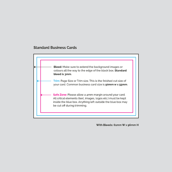
No machine can print colour to the edge, hence the requirement for bleed. Full bleed means the image is printed larger or exceeds the final dimensions of the document required. Once printed, everything is then trimmed down to the finished size. Some printers require 3mm, some 5mm. This means an A4, for example, would be 303mm x 216mm, then trimmed down to 297mm x 210mm.
Talk to your printer to make sure you understand their specifications.
Fonts
Ensure you maintain a minimum size for your typography to maintain legibility
A good rule of thumb is to make the company name and logo larger than a 12pt font. Never use any font sizes smaller than 8pt.
Having said that, 8pt on one font can be different to another. Just make sure it is easy to read.
Resolution
Work at 300dpi minimum for best image reproduction. Our printing press is a true 2400 x 2400dpi engine, so the higher resolution your file, the better.
The preferred file format for most printers is a High Resolution PDF. Why?
A PDF can be set up to give your printing company all the information they need to eliminate problems, avoid delays, and print your project exactly as you intend it.
Also, other documents frequently cause problems with non-standard fonts. Whereas a PDF with embedded fonts will usually avoid that problem.
Finally, although a PDF usually means people can’t accidentally make changes to your design, a PDF can be edited by your printer – which can be a good things
So, PDF
Colour
Design in CMYK unless you’re working exclusively with spot colours.
Both RGB and CMYK are modes for mixing color in graphic design. As a quick reference, the RGB color mode is best for digital work, while CMYK is used for print products.
Break the Design Rules
Now we get to the fun stuff.
The rules are there for a reason. They are helpful most of the time.
But sometimes you need to break out of the box in order to stand out.
The back shouldn’t be boring
Try these ideas:
-
- Add a relevant and meaningful image to the back of your card, with your slogan, or a brand promise
- Showcase some of your work so people know what to expect from you and get excited
- make a special offer – turn it into a voucher or coupon
- Add a QR code that send them to your social media or YouTube channel, to see recent projects you have completed
- Is your business hard to find? Add a map.
- Add 1 or 2 testimonials
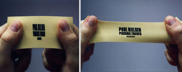
It doesn’t have to be a rectangle piece of card
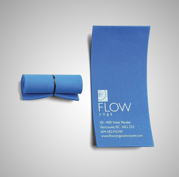
-
- A yoga company printed tiny rubber yoga matt business cards that actually roll up
- Another fitness centre had cutouts so that you could put your fingers in an d do stretches
- A garden centre made their business card into a seed packet
- A personal trainer printed rubber cards that are only readable when they are stretched
- A picture framing company cut out the entire middle, leaving only a picture frame
- A restaurant business card that was also a salt shaker
- A guitar tutor adds line and raised dots for the fret positions
I’m sure you get the idea.
Talk to your printer to see what is possible.
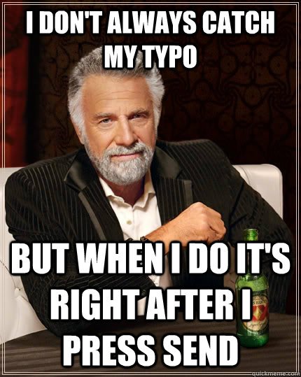
Get Someone Else to Proofread it
Mistakes are crazy. I’m sure you already know this. They have a magic ability to hide, leave temporarily, or wear an invisibility cloak.
So for the love of Mike, have someone else check your work before you send it to the printer.
Preferably a detail person. An administrator. An auditor might work.
“Murphy’s law says that the likelihood of missing typos is directly proportionate to the urgency of the print job”
Do not send it away without checking.
Hire a Professional Printer
Don’t print them yourself.
Business cards are very cheap to print professionally. The results will always be worth it.
Not only that, but good printing companies don’t just order takers. Their goal is to become an extension of your business, providing all aspects of print, signage and everything in between that your company requires.
An excellent print company will have a team to handle all aspects of brand management, and will go out of their way to know your business and too continually over achieve!
Find that print company now.
BONUS: Double Down
There are lots of practical reasons why you should create double-sided business cards.
Practical Schmactical!
The main reason to create double-sided business cards is to delight and surprise.
Business cards can create impact and interest. They are memorable, long after you met the person who gave it to you.
So do your brand experience a favour and get creative with your business card.
It will be worth it!
About Virtual Print
We are a New Zealand based printing company and offer our online printing services across New Zealand. At Virtual Print, we love helping businesses with their printing, signage and other aspects of branding. We print it all – from brochures, labels, posters, business cards, desk calendars, banners , booklets, book printing to specialty items.
Are you designing product labels? You might like the following article:
8 Critical Steps to Design the Perfect Product Label